Campaign · 2025
Project Plymouth
A development brand loud enough for the hoarding.
Overview
A development brand loud enough for the hoarding.
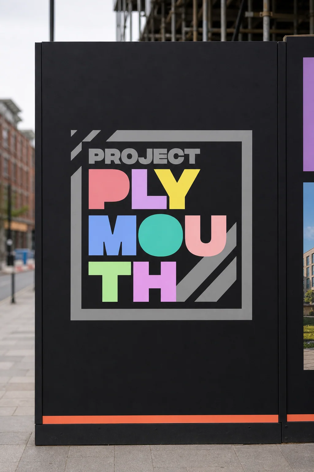
Property hoardings are usually beige and forgettable. Project Plymouth goes the other way: a stacked, block-colour wordmark in six tones — pink, purple, yellow, blue, teal, green — framed inside a construction-grey box with diagonal hatch marks. It reads from across the street, it photographs for social and it turns a building site into a landmark.
Decisions that mattered
Six colours, one system
Each letter carries a different colour from the palette — bold enough to own a full hoarding panel, legible enough to stamp onto a business card.
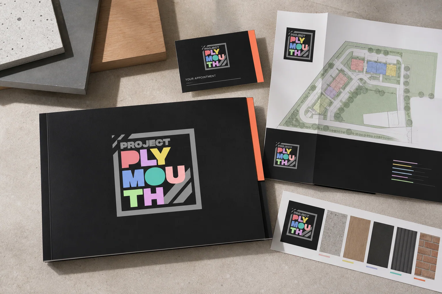
Print follows hoarding
The development brochure, site plan and appointment cards all use the same mark, so buyers see one identity from street to sales suite.